
Impactica: Branding
This project reimagines the visual identity of Impactica, an Edmonton-based print company. As Impactica shifts to a more accessible, online-focused model catering more towards individuals and small businesses, the goal was to develop a lively and business-casual brand identity that feels as inviting as a “lunch meeting.” Building on their original logo, I refined it to retain authenticity while introducing a vibrant, playful system inspired by the act of printing—layered colours and printer’s ink. The updated identity includes cohesive patterns, colors, typography, and graphic elements. Circular, halftone-inspired patterns and layered opacities give the brand a retro, fun feel, while still feeling modern to resonate with a youthful audience. Rounded corners on the logo enhance its friendly, and approachable look. The refreshed system brings Impactica’s voice to life, ensuring a consistent and memorable presence.
This Project Involved:
Visual Identity Expansion
Logo Revisions
Brand Strategy
Packaging
Client:
Impactica: all about print

The Details
Colour
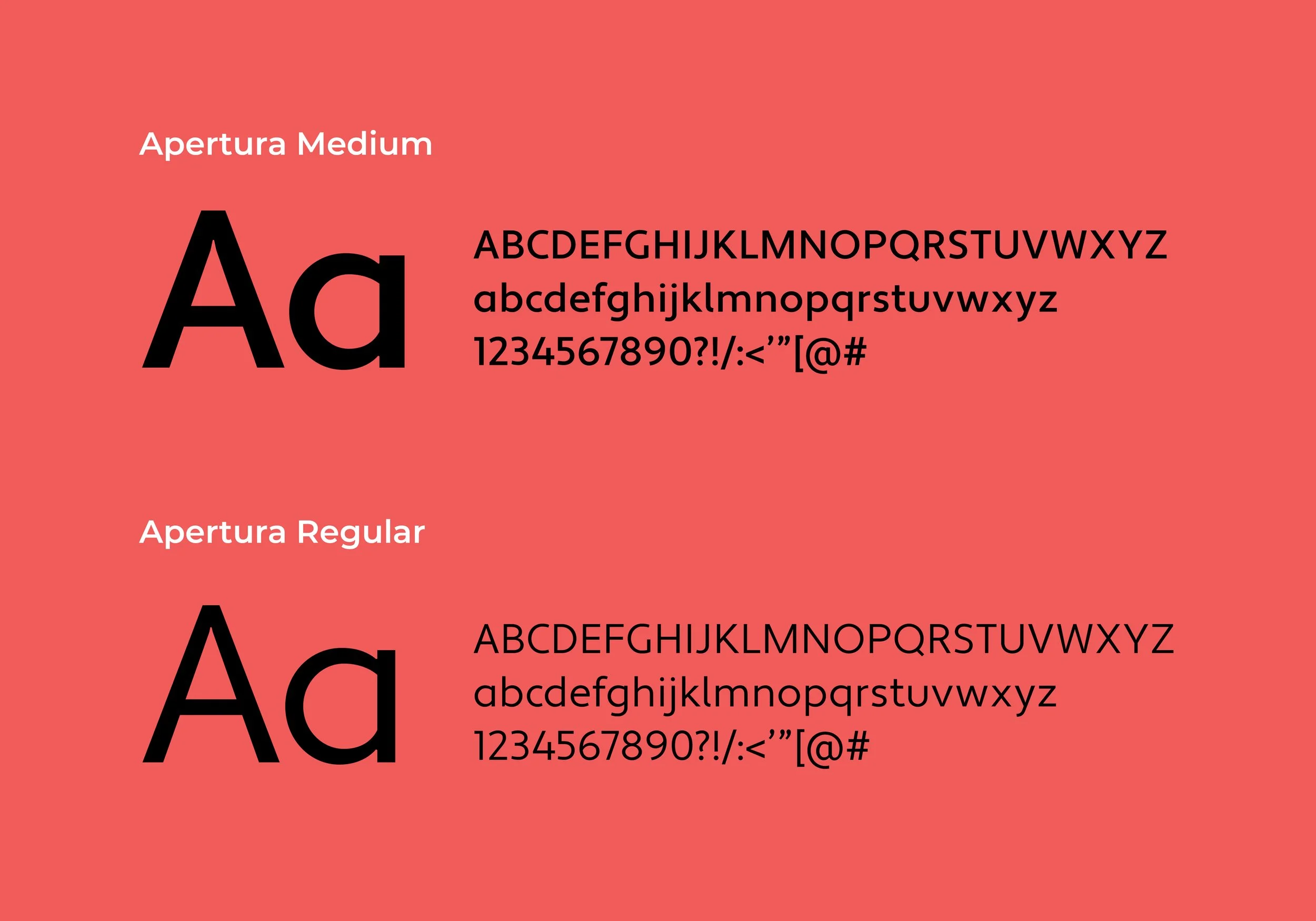
Type

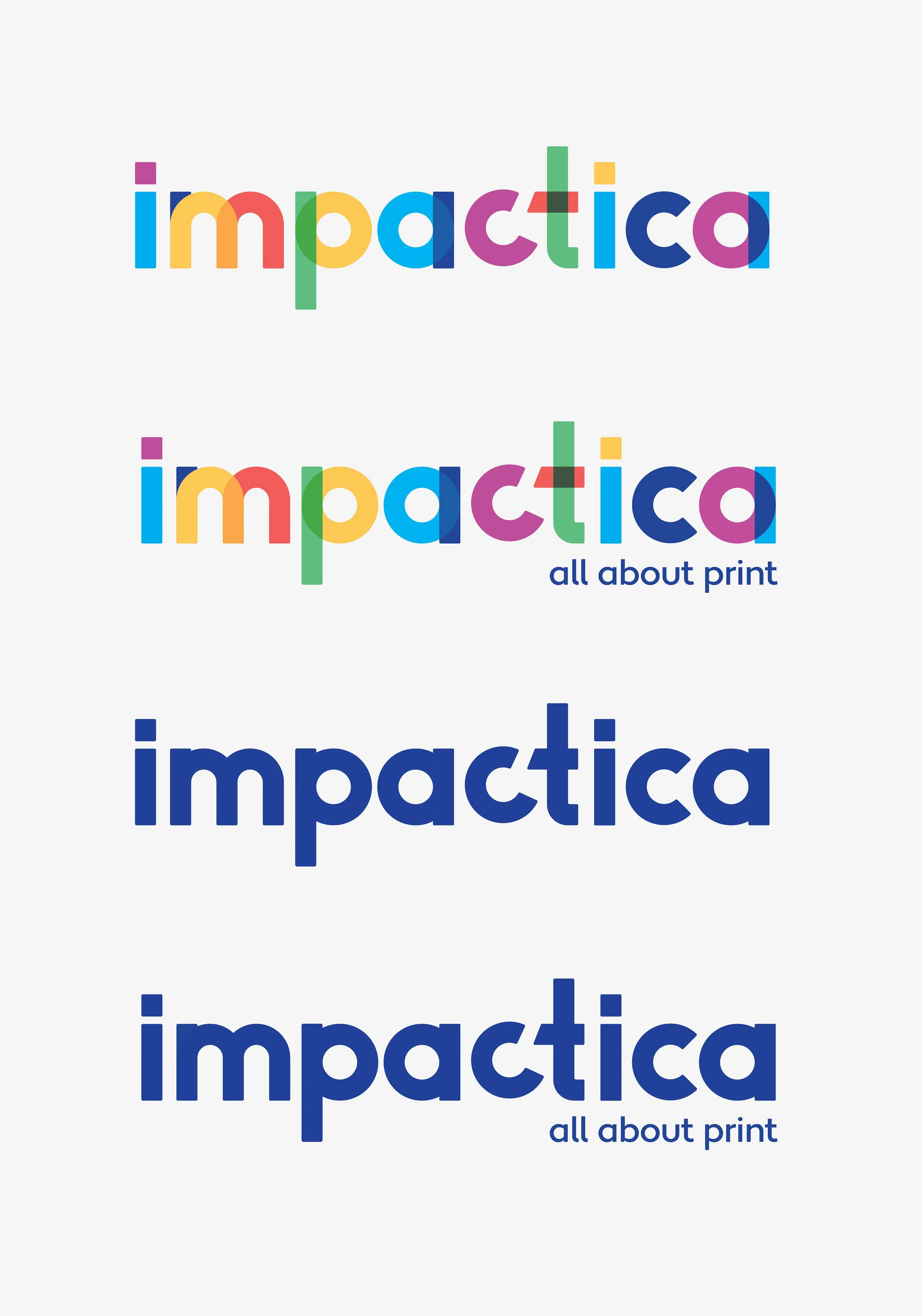
The Logo

Applications

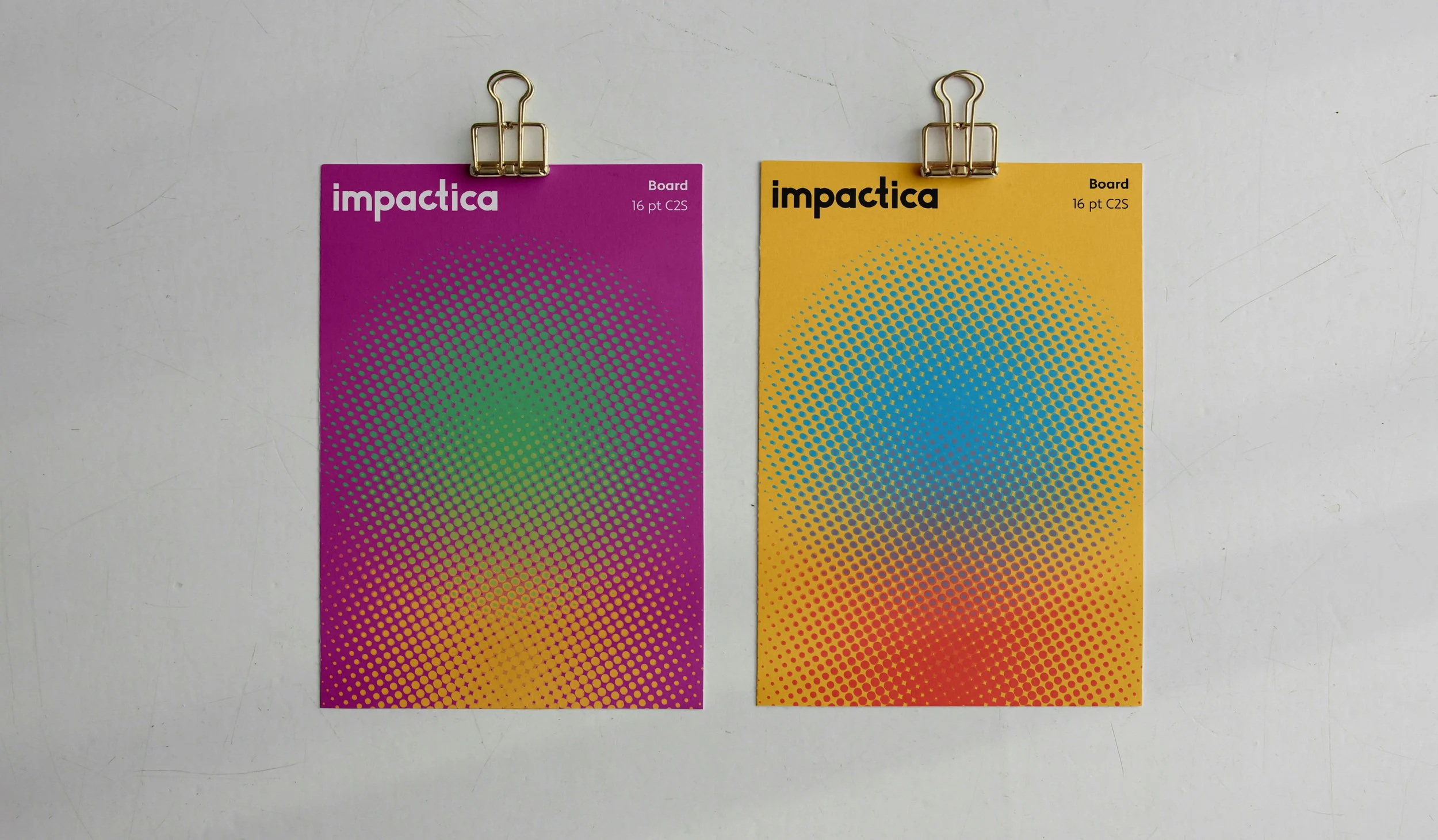
Paper Sample Cards

Paper Tape

Business Card
PR Box
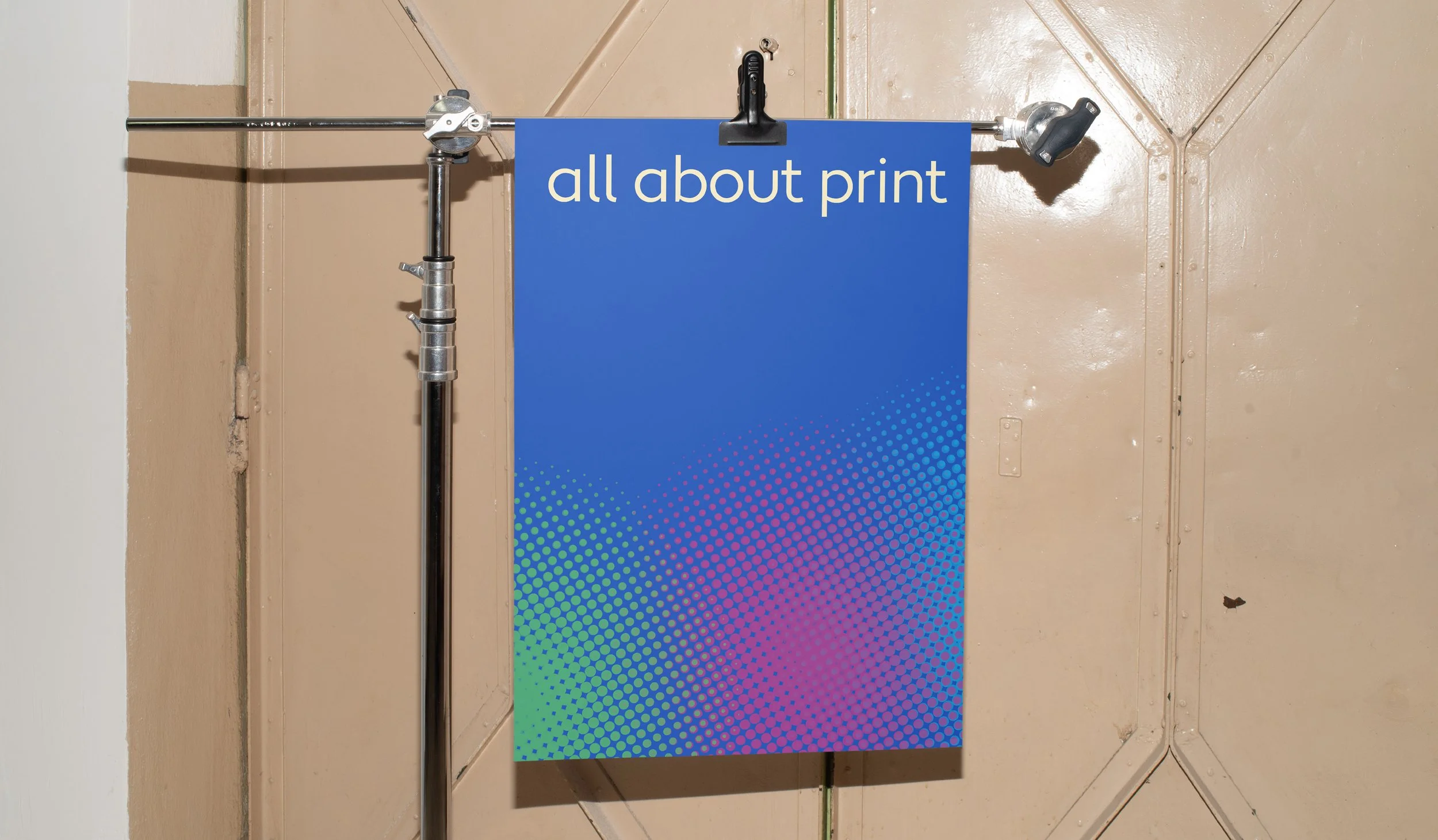
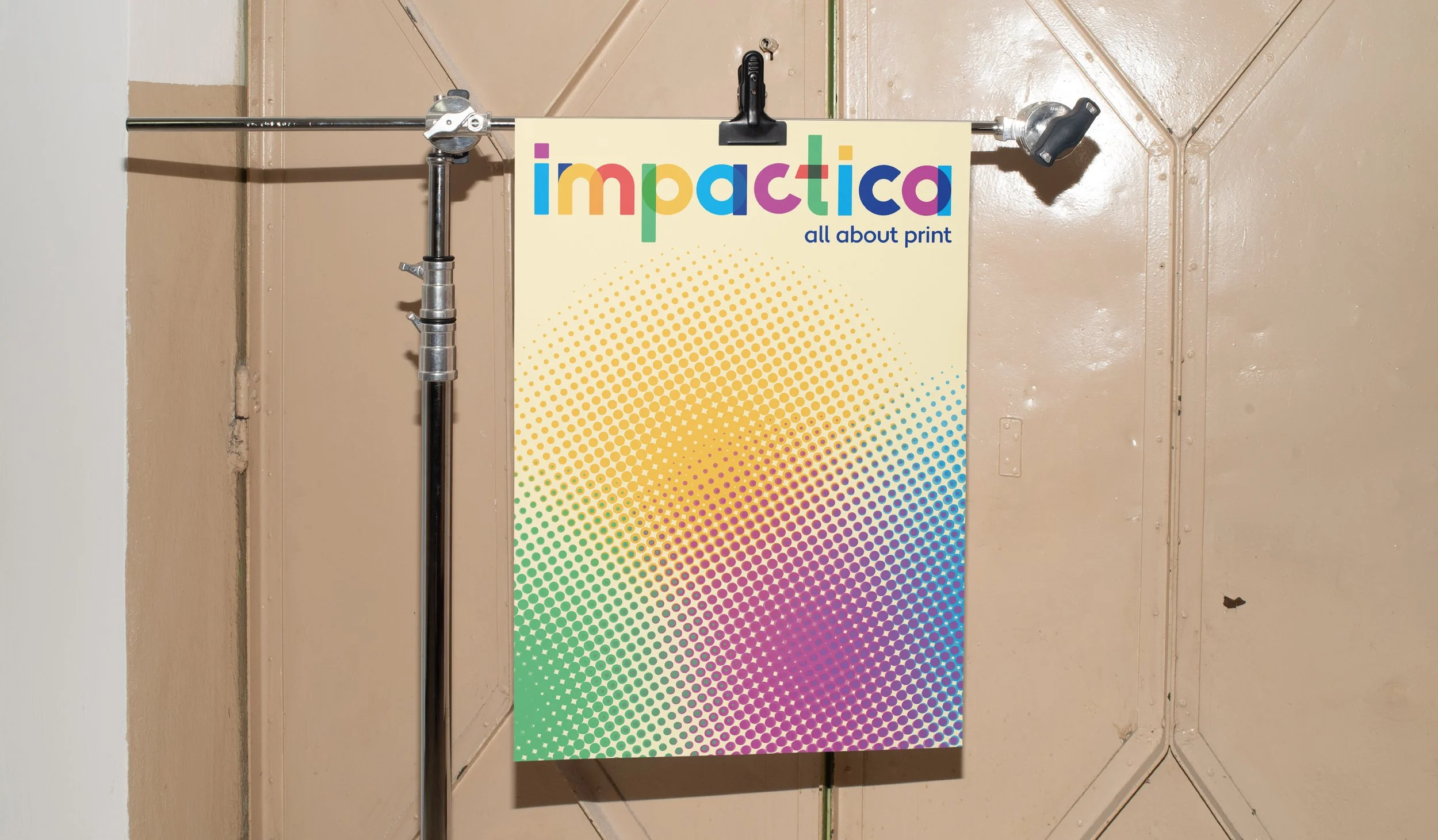
Poster A

Poster B

Instagram Profile

Sustainability Instagram Story Post

Promotional Instagram Story Post
Stickers
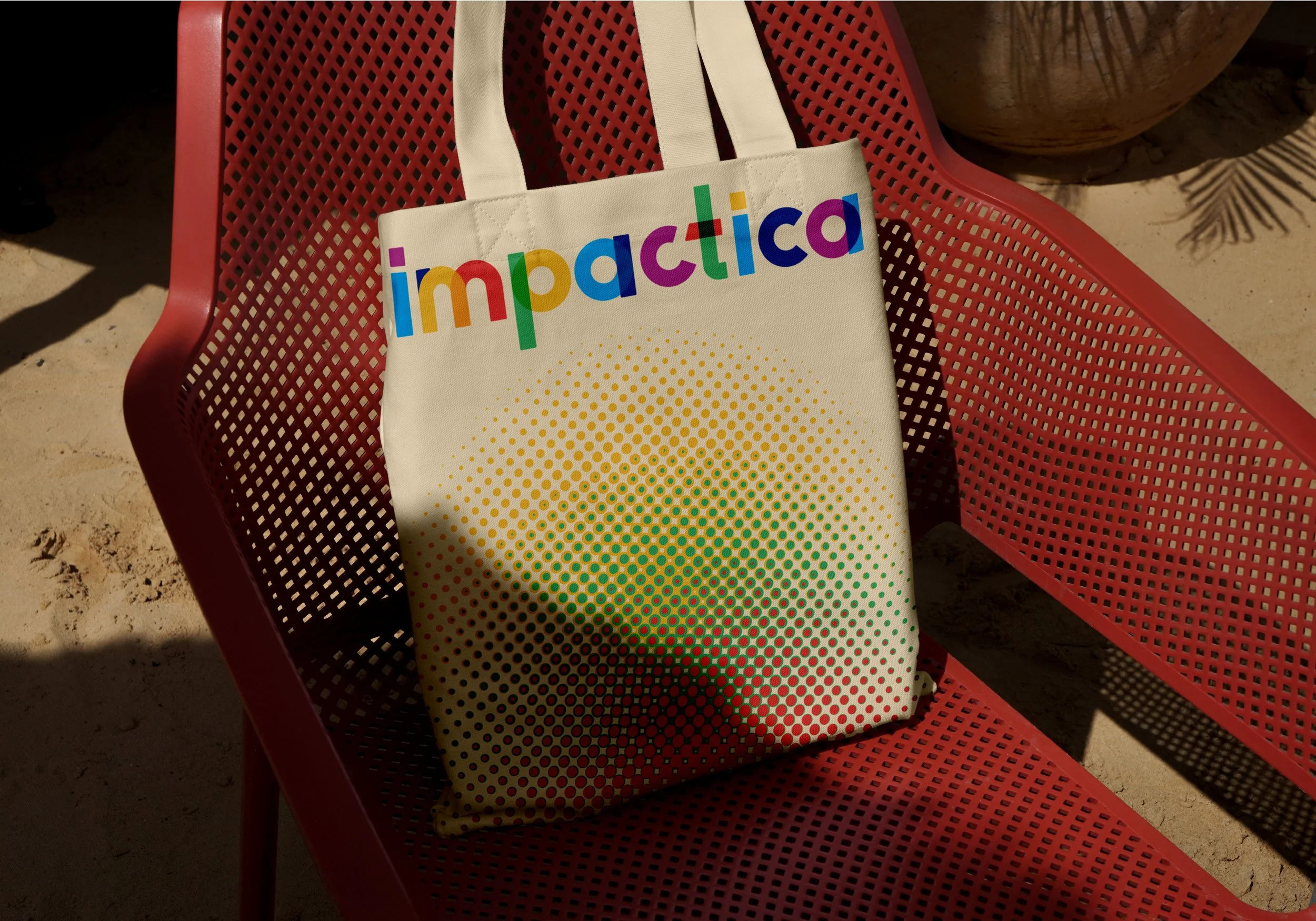
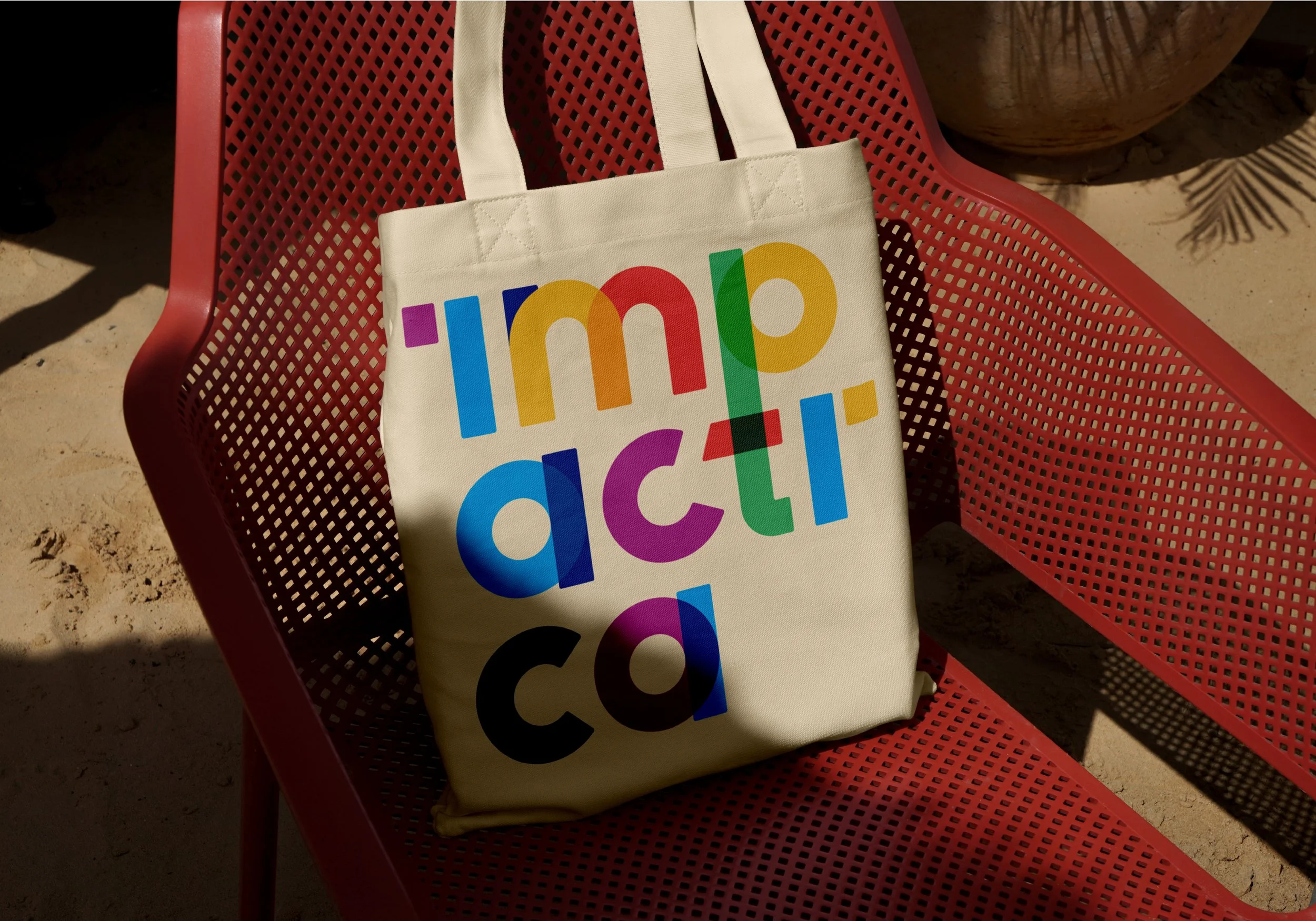
Tote Bags
This project was initially a challenge for me. Working with Impactica’s original logo was outside my comfort zone, as the colors and vibrancy didn’t align with my usual design preferences. At first, I tried simplifying the palette and reducing elements, but each change seemed to strip away what made it feel authentically Impactica. Instead, I embraced the full color set and worked to build a cohesive identity around it. Collaborating with Chad and Derek, the brothers who own Impactica, was a huge inspiration. Seeing firsthand the passion and integrity they put into their work motivated me to create a visual identity that truly reflected their values. The design process was hands-on and tactile—I explored paper swatches, stacked CMYK overlay sheets, and ran constant test prints. This approach helped me develop a unique visual language that felt right for a print company navigating an online space.